I have created an article to feature in my magazine. I have used photographs from my own personal Instagram and used them to anchor my story of 'A student's day out in Newcastle'. I challenged myself by writing as if I was a female sixth form student, writing in present tense. I used a variety of fonts both serif and sans serif (different styles) to create a Typography that makes the article visually interesting while contributing to the informal tone of a magazine. I created a subheading in bold and header, alongside columns of writing to reflect typical conventions of a magazine and article.
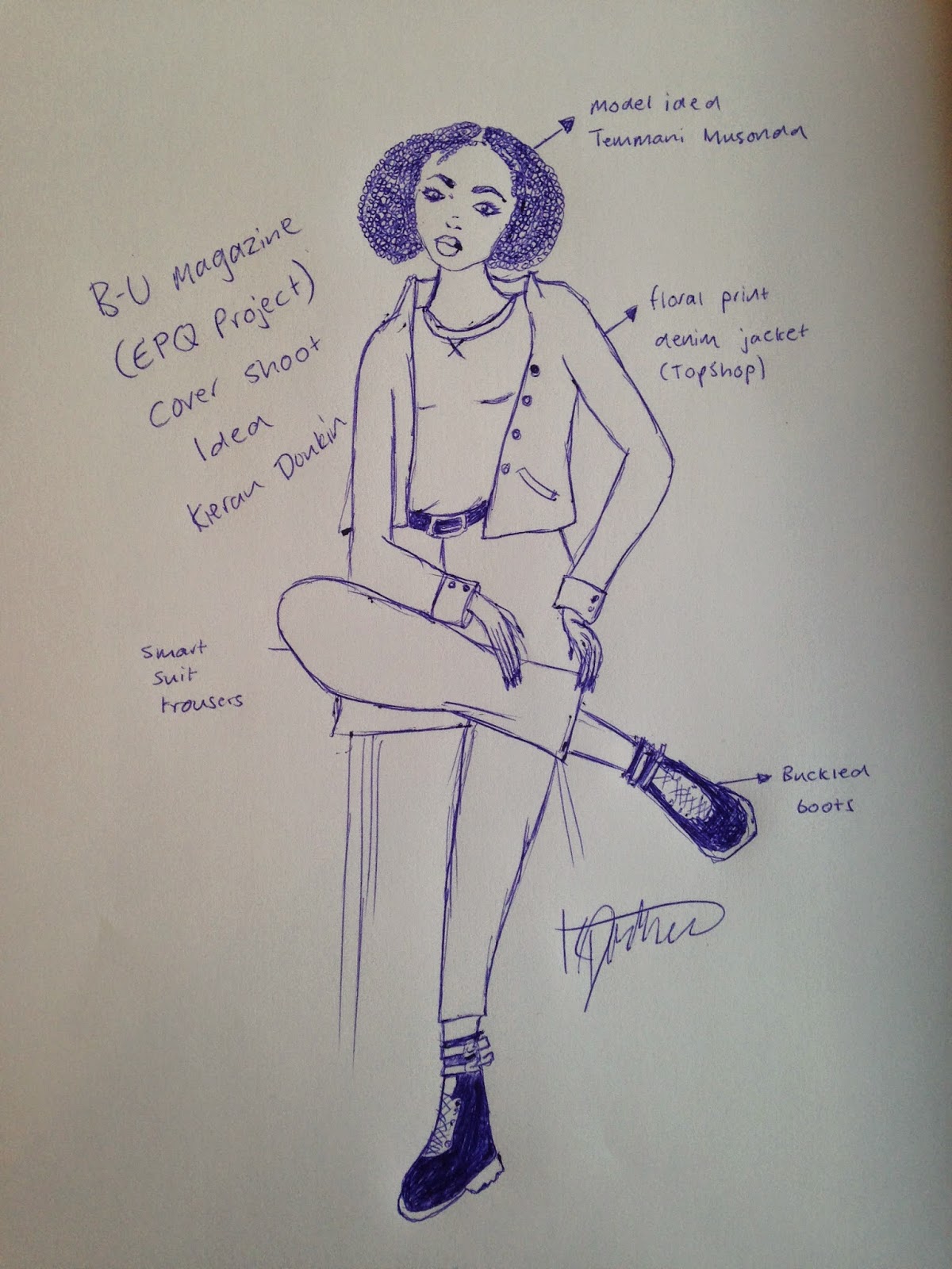
A blog to record my research, planning and development of my Extended Project Qualification (EPQ). I am creating a fashion/lifestyle magazine for a young, modern female demographic.
Wednesday, 13 May 2015
Saturday, 9 May 2015
Contents Page
This is the contents page from an issue of established magazine "The Face". I love the modern, simplistic design and will use this design for my own inspiration. The rotated heading 'Contents' edited in a zigzag style banner I find really appealing as it strays from traditional conventions of a magazine and, because of this, believe it would appeal to a current demographic similar to mine.
This is the work in progress of my own contents page for my magazine EPQ. Overall I am happy with the outcome of my title. The use of the sans serif font 'Century Gothic' partnered with certain letters edited in a outline format, contributes to the modern theme of my product. It is quite urban in it's style. I imitated the zigzag shape from The Face magazine into my own page. I find it projects quite an 'edgy' atmosphere through the connotations of the sharp edges. I am in doubt about the use of yellow in my palette and am in two minds whether to continue this colour scheme or abandon it. I am definitely keeping the deep pink colour as it is anchorage of a female magazine but I am still undecided on the yellow. The layout of my contents list is visually interesting due to the page numbers being edited in a serif font to show contrast, showcased on different sized black circles. However, this may be a misleading layout due to the wide variety of sizes so I will take into consideration that a change in approach might be necessary. But overall I am pleased with development so far.
Wednesday, 6 May 2015
Inspiration


These particular magazines I found inspiring as they are what I am looking for to appeal to my modern female demographic. The artistic/fashion theme is consistent and visually interesting while breaking from traditional magazine covers and appealing to a more young and current audience that are generally more accepting of new things.
Audience
I am targeting an all-female audience aged from 16 to 30. I have chosen quite a young and modern demographic because, in my mind, I want the content of my magazine to touch upon quite current issues and problems that young people (particularly students) might face and I will use my own personal experience to make my product as authentic as possible. The aim is for this magazine to be relate-able while still carrying conventions of a traditional high-fashion magazine. I am thinking of writing articles about sixth form, A levels and university choices in order to appeal to this specific audience. In terms of colour, I am thinking feminine colours like a vibrant, deep pink to appeal to a female demographic but also including quite illuminated colours like a bright, popping blue, bright green's and oranges to reinforce my modern theme and target. My photographs will be of female models to anchor the all-female audience and will do this through the content of female fashion and clothing as well. Also, I will design this magazine with content that can be glanced at, consuming relevant information without wasting time through the use of puffs, strap-lines, subheadings and headings. This will appeal to an audience who is busy and always on their feet; ideal for students with work to complete.
Monday, 4 May 2015
Friday, 1 May 2015
Intro
Since being small, I have always had a creative interest in designing, writing and publishing. At the age of six I wrote a series of short magazines aimed at a young demographic called 'Magic Magazine' which, in a nutshell, provided advice on how to become magic through interactive games, puzzles and fun facts. This hobby evolved over the years and now, at the age of 17, I am still equally, if not more passionate about the industry and how it communicates to an audience through both language and visuals. I channeled this passion into my A level choices which resulted in me studying English Language, Media Studies and Fine Art and I wish to progress onto university to study the magazine industry in greater depth.
When the Extended Project Qualification was introduced to me, I took no hesitation in deciding to develop a magazine and thought it to be a great platform to demonstrate my writing ability, design and development skills and photography skills. Although I still have a lot to learn and there is huge room for improvement, I believe that by pushing myself to create a finished magazine product, I can exercise my basic skills and will give me essential practice for my future.
Kieran Donkin
Subscribe to:
Comments (Atom)


.JPG)